Creation of a consumer brand centred around Belgian confectionery, translated into a scalable retail concept.
Food, Consumer goods & retail, Hospitality, Product branding, Merklancering, Online marketing, Offline marketing
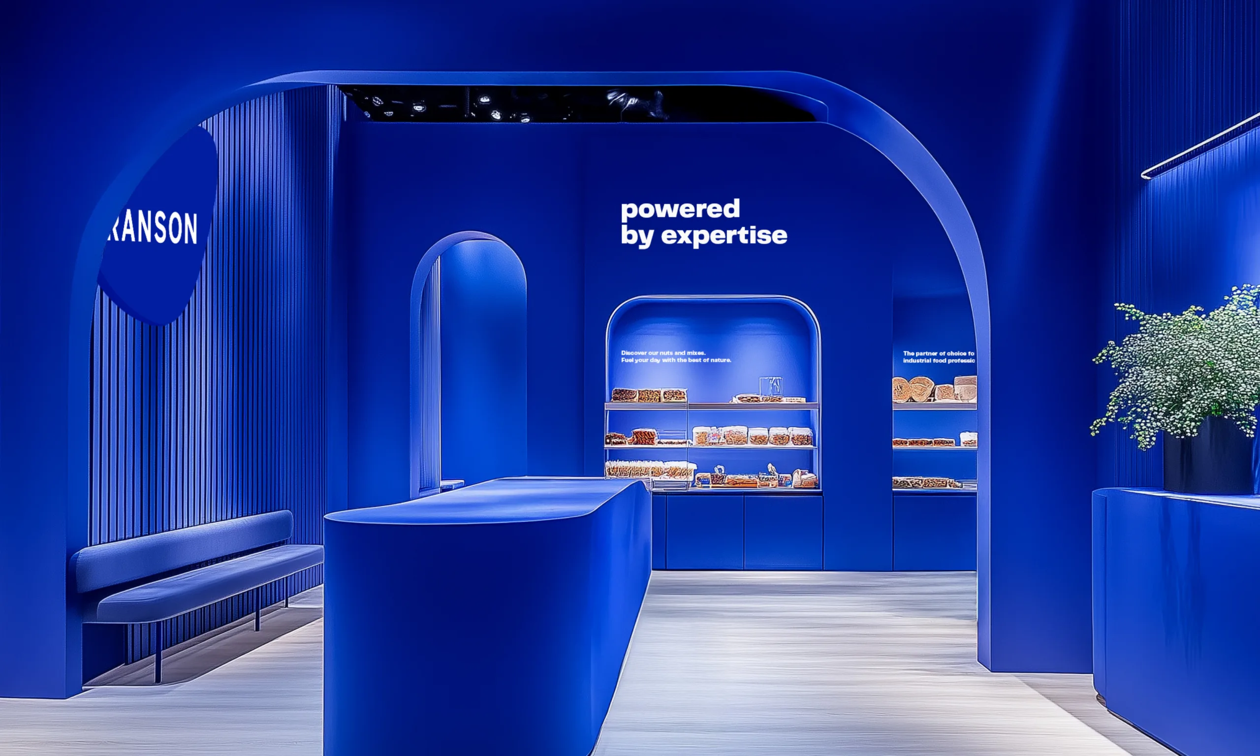
Powered by expertise
To strengthen its position as a partner for every step of the food industry, Ranson turned to MOQO for a brand update.
 Video: RANSON CASE HEADER
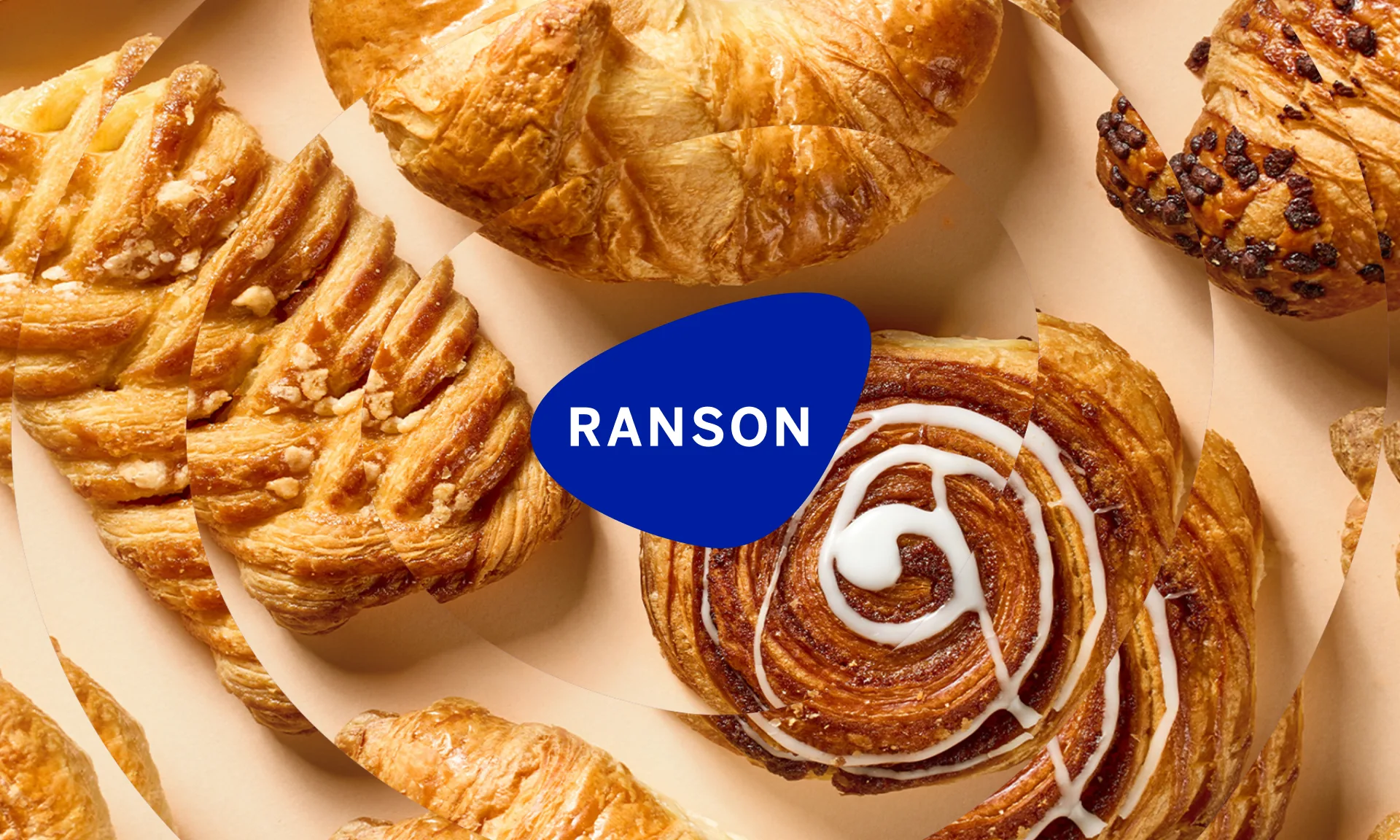
In the rapidly evolving food industry, distributor, producer and trader, Ranson is seeking to broaden its market reach. Originally focused on raw materials and ingredients for bakers, the company’s expertise now spans far beyond.
To strengthen its position as the go-to partner for every step in the food industry, Ranson turned to MOQO for a brand update. Our approach? Keep it simple. From brand architecture to logo, we brought clarity and cohesion to the Ranson brand.
 Video: RANSON CASE LOGO HISTORIE
 Video: RANSON CASE SELECTIONS 01
 Video: RANSON CASE BROCHURE COVERS DIGITAL
 Video: RANSON CASE APP
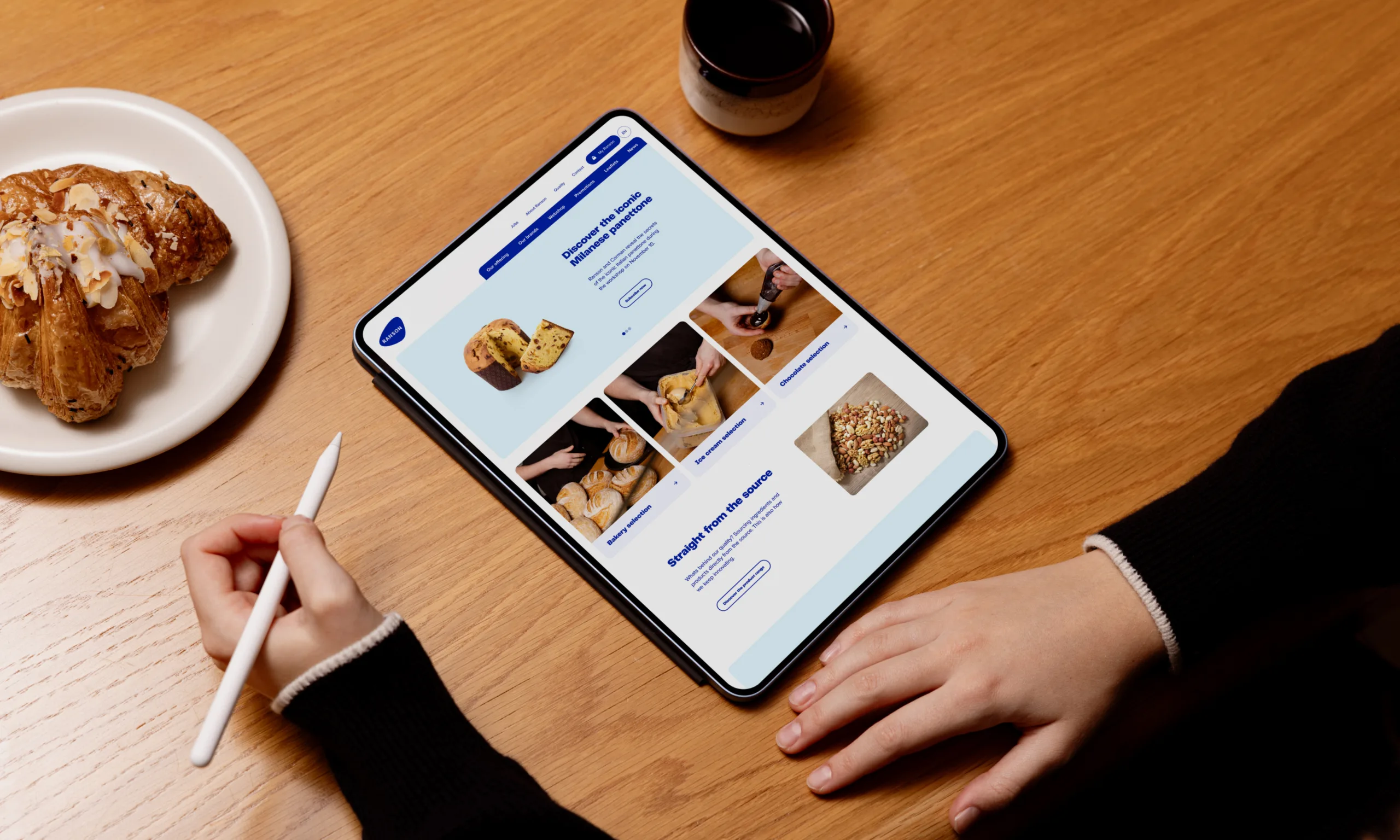
The signature blue remains the primary colour, while warmth is introduced through complementary, soft tones assigned to each product category, from the ice cream to the chocolate selection.
A new base font, PP Telegraf Black, provides a powerful and distinctive identity for the brand.
 Video: RANSON CASE PRODUCT APPS
 Video: RANSON CASE SOCIALS 2
 Video: RANSON CASE SELECTIONS 02

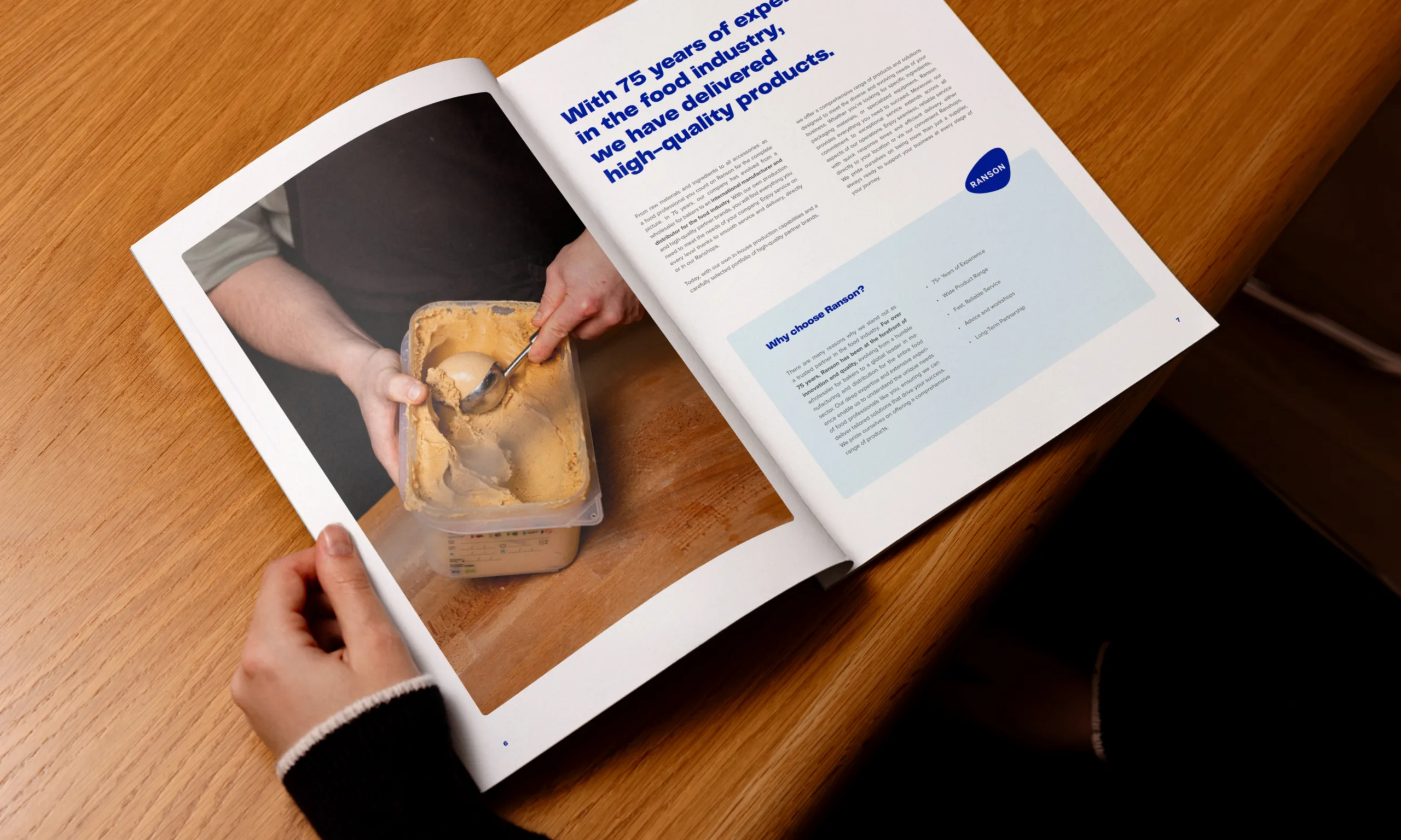
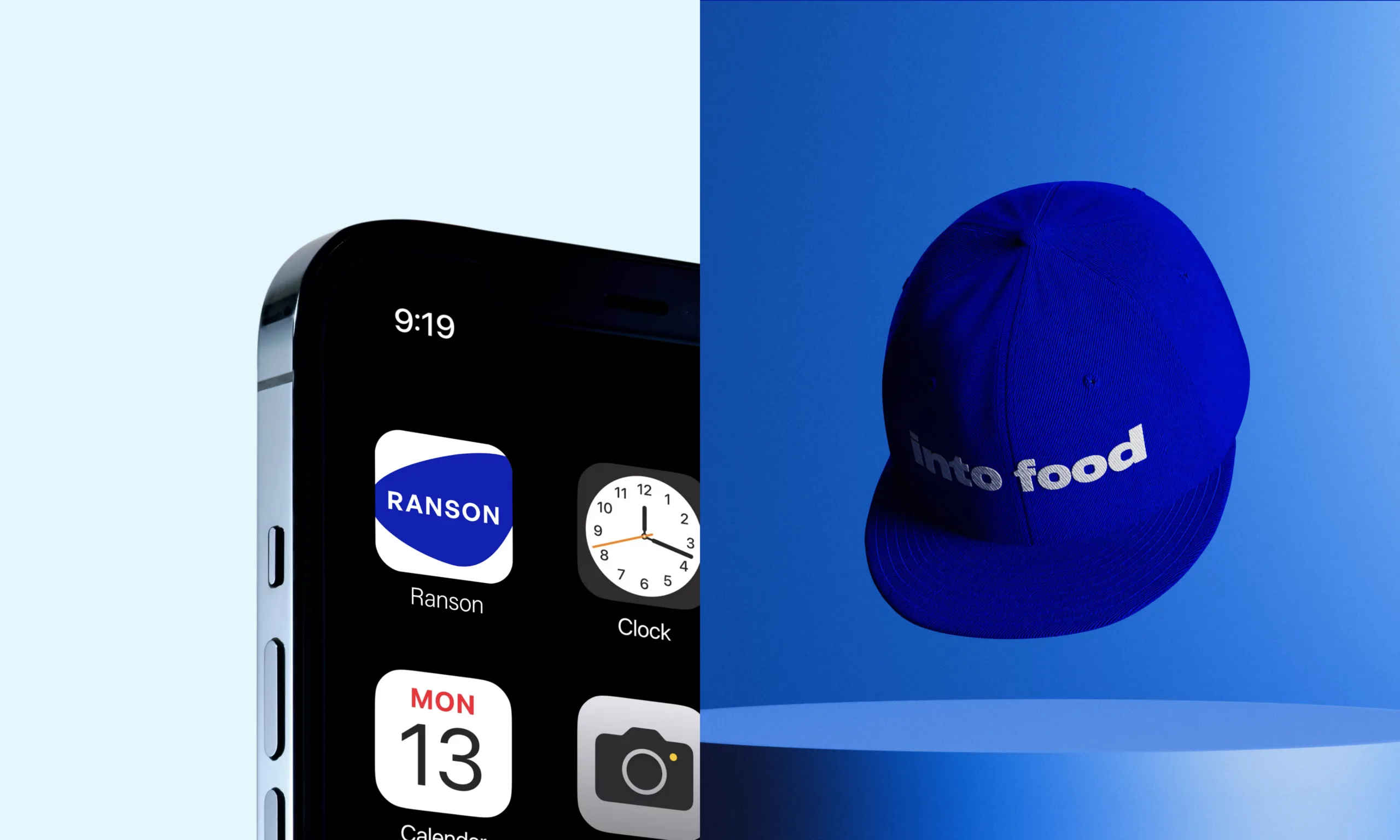
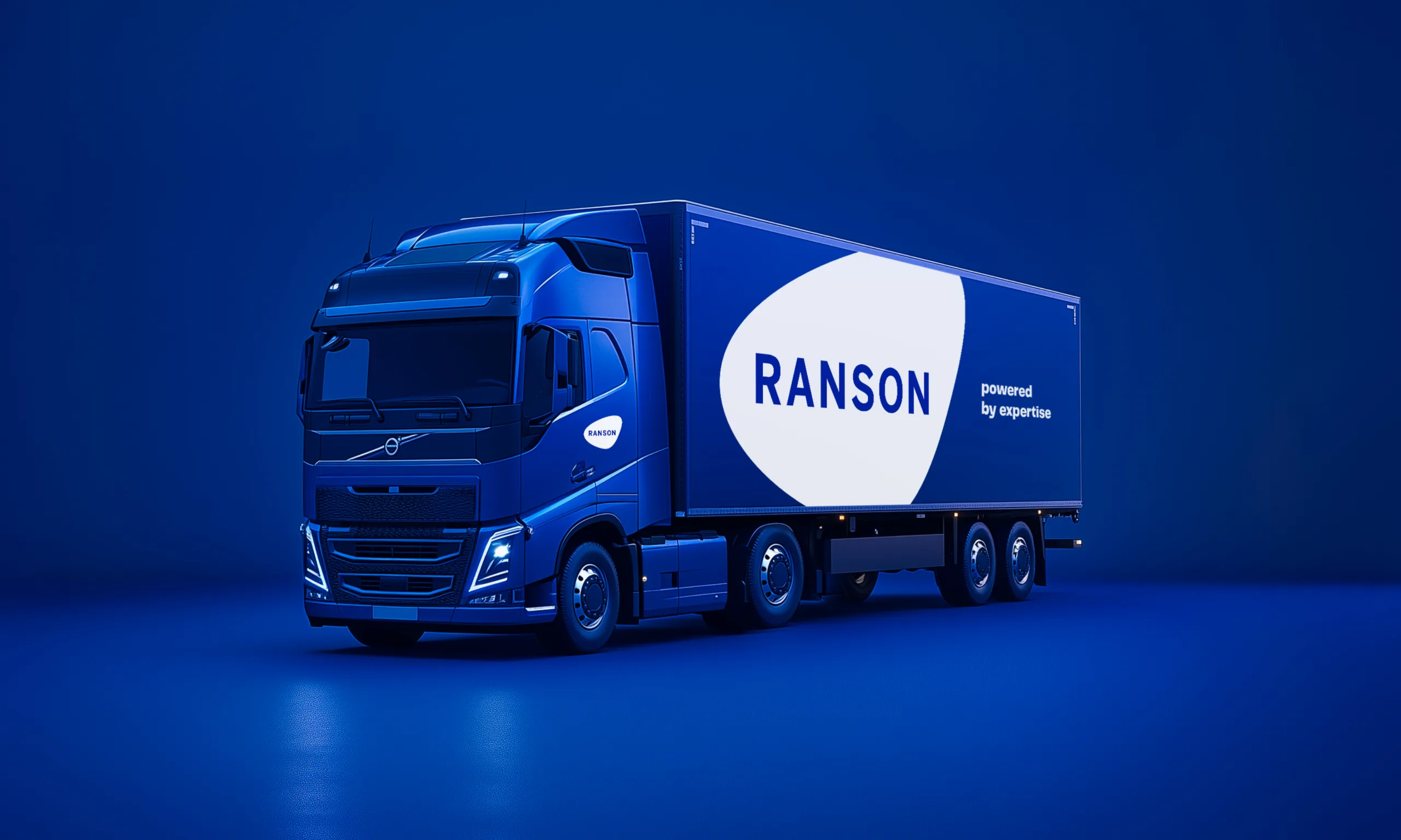
To ensure a seamless roll-out of the rebrand, we supported Ranson with the design of new catalogues, truck decals, email signatures, social media templates, and more.
As the icing on the cake, we created a brand video that dynamically presents Ranson’s story, from 1948 to the present day.
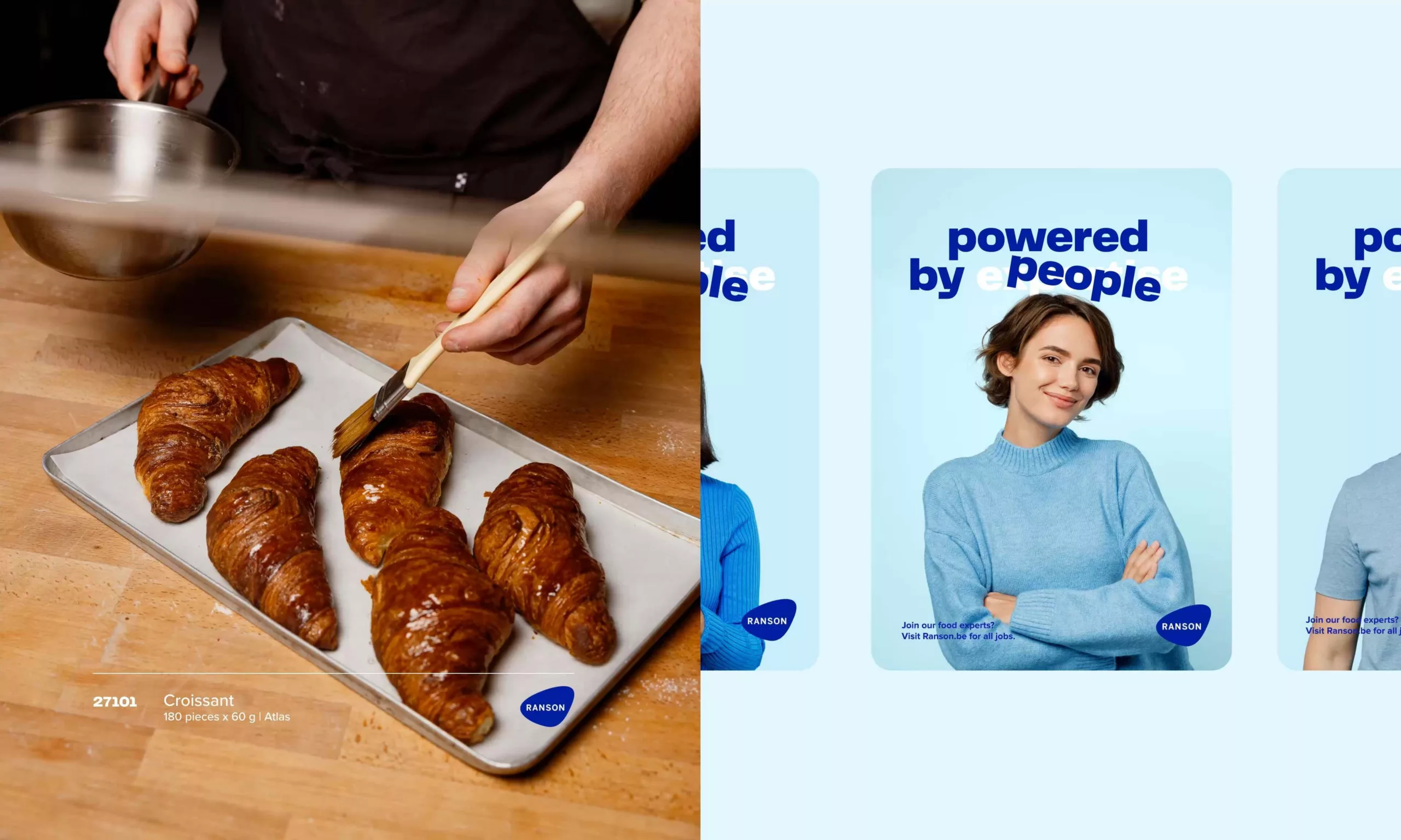 Video: RANSON CASE PEOPLE
 Video: RANSON CASE MEETING slower
Related work
Creation of a consumer brand centred around Belgian confectionery, translated into a scalable retail concept.
Food, Consumer goods & retail, Hospitality, Product branding, Merklancering, Online marketing, Offline marketing
This blooming rebranding boosts growers’ pride, raises awareness and makes a strong impression on the market.
Food, Corporate branding

Nostalgia shapes our rebranding of Chocolaterie De Schutter, a specialist in hollow chocolate goods for all seasons.
Food, Corporate branding, Offline marketing